
Wednesday, 31 December 2014
Ancillary Planning | Digipak & Advertisement Photographs
[Please click on the 'i' (bottom left hand corner) to read the description of each image]
Tuesday, 30 December 2014
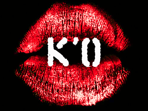
Ancillary Planning: Trademark of Kayla'O
REMEMBER THAT PRETTY KISS MARK...
This is something that I designed a few weeks back. It is a 'trademark' of the artist, another little signature that the artist's audience can identify with.
This is something that I designed a few weeks back. It is a 'trademark' of the artist, another little signature that the artist's audience can identify with.
As you can see, the image holds the artist's initials and a kiss mark. Within the image, it also repeats the colour theme of the artist's album cover. I believe this image will be a fantastic promotion tool because of these things. I plan on using it within the digipak, advertisement, concert posters and more!
Ancillary Planning: Mock- Up of the Digipak (The Diagrams) (PART 1)
This features pictures of the first stages of the mock-up digipak:


THE FRONT:
THE BACK:
Ancillary Research : Detailed analysis of three magazine
First Advert:

The first magazine is from Ellie Gouldings album "lights",Synergy is used throughout the advert as we can see the same colours used.The artists hair and the colour of the text are matching along with the top half of the background.Like all good adverts this one contains a large and clearly visable artist name in order to help promote the artist as well as the album.The advert includes a review from the target audience as well as a rating out of 5 which helps people decide wether they want to buy this album or not.The image used of the artist is a close up shot in order to promote the artist and make people aware of who the artist is,on the top half of this advert we can see some glitter,this helps the audience identify what genre this artist and her music belong to.
Second Advert:

Third Advert:

The main colours used in this advert are white,blue and black,
The block of flats in the background could possibly connote that Wretch 32 comes from a deprived background,The advert contains little hints o what to expect from the album such as guest appearances which makes the audience excited.The colour blue is used to represent clouds and as it is a bright colour it could mean he has had a dark past but his future is bright.
Ancillary Research: Detailed analysis of three digipaks
http://prezi.com/cmnvdcvvqyty/?utm_campaign=share&utm_medium=copy
Monday, 29 December 2014
Ancillary Planning | Shortlist of Digipak Ideas
Below is a short explanation about the ideas I have for the layout, colour scheme and font.


Saturday, 27 December 2014
Planning Ancillary Products: Photos I plan on using for the digipak & advertisement.
Post the photos that you plan to use on your digipak advertisement -
inclue a brief overview of the reasons why they are in your short list.

I think I might use these four images for my digipak. The reason being is that they all look away from the camera and the audience, the artist is not making direct contact. And as you have already seen in my previous posts, the pop artists I've researched and took inspiration from, all look to the side of the camera.
If needed, I will go back into the photography studio and shoot some more images, however, I will experiment with what I have at the moment and decide whether anything else is needed.
The Image I'm thinking of using on the cover is on the top right hand corner (extreme close up). I feel like the signature red lipstick stands out, and I feel like that would be something that draws our audience to the product.
Also, the image is really detailed and in focus, therefore when I run it through Photoshop it will be easier for me to edit and work on the blemish.
Since it's a close up the image does not need to be stretched or dragged, as that's one of the Don'ts I mentioned in my previous post.
Friday, 26 December 2014
Planning Ancillary Products: Brief overview of the 'Dos' and 'Don'ts' of design work.
Brief Overview: Do's and Don'ts

created by bubbl.us (screenshot below)

Thursday, 25 December 2014
Cinema Screening: Thursday 18th December 2014 (Duygu)
Finally the day everyone was waiting for arrived, Esther & I was extra excited as we didn't get to watch our film opening last year. I had a dance exam on the day of the cinema... yep that's correct an exam, while everyone was having the time of their life I was rehearsing my ass off. We proudly watched our music video knowing all the hard work had paid off and of course we recorded it, here it is... Kayla'O - Bass Like Home on the big screen :D
2
Wednesday, 24 December 2014
Planning Ancillary Products: Where my ideas came from!
Show where your ideas have come from- link to existing ancillary products.

Tuesday, 23 December 2014
Cinema Screening: The Reaction! (Esther)
This is the reaction video of our peers while they watched our music video (Thursday 18th December 2014):
Monday, 22 December 2014
Ancillary Research: Design Activity (Part 2)
This is a poster idea I designed to go along with the album cover
Planning Ancillary Products: Short list of fonts, colours, layout and design ideas!
Short list of: colours, layout and design ideas
Why did I choose those fonts, colours, layout and design ideas?
Fonts: I chose these three particular fonts because, they were bold and they stand out. Since Kayla'O (myself) is a new artist, I wanted the font to attract our audience.
Colour: Since the song is about Britain and British pride, we wanted to incorporate the Union Jack colours, white, blue and red, and have a black background so the colours pop out even more.
It's all about catching our audiences attention, and with the big bold fonts and contrasting colours I definitely think that's possible.
Layout: I took inspiration from other pop artists such as Rihanna, Beyonce, Marina and The Diamonds, One Direction, Lana Del Rey, and I wanted to do something similar.
My idea is to have a black background at the front of the CD, the music title in Bold.
A Picture of the artist (myself) blending in with the background and name at the bottom of the page.
At the back of the album cover I was thinking of making a dark red background with white and black font or something incorporated to the British flag.
What I forgot to add was, that at the front of the Album Cover I will have a small Vendetta on the bottom left of the album because, bonfire night.
I think my design will be quite basic yet bold and powerful all thought the digipak. I'm really liking this idea and I think I'll stick with it.


Thursday, 18 December 2014
Wednesday, 17 December 2014
Cinema Screening
Tommorow we will be visiting the screen in the green cinema to view our music video along with our friends and classmates music videos,we will be able to congratulate our friends for the hard work they have put in creating their music videos aswell as having the chance to get some final feedback on our music videos which is always good
below are some questions i plan to ask tomorrow;
-What would you rate our music video out of 10?
- Which parts did you enjoy?
- What improvments do you think can be made?
below are some questions i plan to ask tomorrow;
-What would you rate our music video out of 10?
- Which parts did you enjoy?
- What improvments do you think can be made?
Tuesday, 16 December 2014
Sunday, 14 December 2014
Ancillary Research: Design Activity (Part 1)
This is a made up digipak I created for a made up band...
The process of making the digipak:


The final results:

Ancillary Brief: The Introductions
Even though I have been fortunate enough to have a head start in this part of the project, it's still important to take down the basics...
Ancillary Research - Lesson summary Thursday 11-12-14
Thursdays lesson was a little bit similar to Tuesdays,Below are a few bullet points to sum up the lesson.

- Looking at actually digipaks
- Learning to use Photoshop
- recreating a digipak and improving it
Looking at digipaks
In the lesson we looked at digipaks of artists we are familiar with in order to give us a brief idea of how a digipak is layed out and the codes and conventions,some of the digipaks contained 2 panels and others contained up to 6 panels but we were told to focus on 4 panels just for now as we are still learning about creating a digipak and more than 6 panels would be hard work.
Leaning to use Photoshop
Our college technician joined our lesson to teach us how to use Photoshop to create our digipaks,he started off teaching us the basics like how to import an image on to Photoshop and where to find some templates the media department have for us.Next we learnt how to use a tool to cut out certain parts of an image that can be used on our template,for example if there was an image of a person standing outside Tower Bridge the person can be cut out and placed non a different background.We were taught how to add texts on to our digipak and a clever way to see what fonts look like.
Recreating a digipak and improving it
For our last task we were shown a horrible digipak which didn't contain any conventions of digipaks and didn't look professional at all,We were told to recreate the digipak and make it look like an actual digipak,
Ancillary Research - lesson summary Tuesday 09-12-14
On Tuesday we were introduced to the ancillary work,
the lesson included looking at the conventions of digipaks such as album and artist name,barcode,song listing and same fonts.
the lesson included looking at the conventions of digipaks such as album and artist name,barcode,song listing and same fonts.
Friday, 12 December 2014
Thursday, 11 December 2014

Wednesday, 10 December 2014
Ancillary Research : Summary of class dicussion
What we discussed in lesson
Below is a brainstorm we created as a class on what a digipak contains,We deicded where each thing goes on the digipak for example the barcode goes on the back.

Below is a brainstorm we created as a class on what a digipak contains,We deicded where each thing goes on the digipak for example the barcode goes on the back.
Tuesday, 9 December 2014
ANCILLARY RESEARCH: Summary of Class Discussion
Summary of Class Discussion
These are the notes which I took during class when discussing the importance of digipaks to the music industry.
What is a digipak?
A digital album / product to be sold.
Cross Promotional Package?
It means using a variety of media products to promote a brand, they rely on synergy.
Advert?
Something that promotes a product or an artist.
Codes and Conventions of Ancillary Products
They are additional media texts that work together to act as a promotional material for the artist. They include CD covers, artworks, magazines, billboards, posters, websites, blogs etc.
For our coursework we are asked to create 2 ancillary products:
- A Digipak
- A Magazine Advert
Why are CD covers still used although sales are dropping?
They are still used as a way to brand an artist, and help an audience recognise the album.
How Important are they?
For the industry and the artist, ancillary products are essential because they help inform the audience about the latest release. They help and create saturation (it's the idea of something being covered).
What are the codes and conventions?
They are the 'rules' that govern the way a media text is constructed so that:
- It looks a certain way
- It contains certain content
These rules are dependent on:
- The media form (what type of music video, magazine, advert etc)
- The genre and the text
These rules create expectations for different products:
- Audiences are familiar with different codes and conventions for different products
- Audiences often base their tastes on the use of different codes and conventions
- Audiences can identify similar products through the use of codes and conventions
- Audiences gain enjoyment from seeing how a product supports or challenge these expectations
Extra Notes:
A digipak is a modern approach to CD and Packaging. The Digipak allows for inclusion of more information about the brand / artist. It's all about value and encouraging us to part with out money for something special and 'extra' plays on our love of music.
What should the outside of your digipak look like?
1. Track Listing: the same font as artist or the album name
2. Production information: copyright and year of production, it should have a web address, and the record label (either a name or a logo). And let’s not forget the distributor, producer and possible a price.
3. Promotional sticker: it should draw attention to recent tour or special feature on the album.
4. Artist (s) name: in a large and clear font, foregrounded. It should be easy to read and the same font should be able to be seen throughout the digipak.
5. Image of artist (s): The echoing visual style and color scheme should be seen throughout the front cover
6. Overall Digipak Style: It should only use 3-4 colors max, and it should only have 2 different fonts. It may include elements of graphic design (not simply images lifted from the video). It must create some sort of visual link with advertisement.
What should the inside of your digipak look like?
1. Graphic Design: the visual style (font, color and design) established on the front of the digipak is continued on the inner panels.
2. Acknowledgements: sometimes included in a short list, in very small font, acknowledgements for particular tracks on the album.
3. Repeat of track list: sometimes included- with more specific detail around length of songs, who played instruments and who wrote the track(s).
What should the advertisement look like?
1. Tour dates, review quotes from magazines and newspapers, record label logo, website.
2. Repeat same graphic style as digipak
3. Prominent display of artist name and album title
4. Usually features image of digipak itself
5. Must include: release date
THIS IS A SUMMARY OF ALL OF THE NOTES WHICH I TOOK IN CLASS, AND IT SHOULD PRETY MUCH EXPLAIN THE IMPORTANCE OF DIGIPAKS.
Sunday, 7 December 2014
Production: Initial ideas and notes for Evaluation Question 2
These are a few notes I need to keep in mind when answering this question:
.png)
Production: Initial ideas and notes for Evaluation Question 3
These are just a few notes of what I need to keep in mind when answering this question.
.png)
Production: Skills Development
This is a brief overview of the new editing skills I've learnt during the editing process of our music video.
It's fair to say that I didn't do as much editing skills as I did last year. This was simply because I struggled slightly when it came to cutting the footage (constantly worried that I was cutting up the wrong thing), editing to the beat, etc. Long story short, it was the best decision to not let me take lead of the editing stage as things would have probably went horribly, horribly wrong. However, I did allow the skills I knew well come to practice once more. I was able to add in filters, slow or speed up footages and making sure the clips were in sync with the footage.

Even though I didn't have much control during the editing process, I did make sure that I was apart of the process as much as possible. It was a team effort after all, meaning everybody needed to have a say. I didn't hesitate to say what worked well and what didn't, give our main editor (Duygu) some advice as well as suggest some of my own ideas.
I would like to take this moment to give a huge thank you to Duygu, who worked extremely hard during this process. I'm very proud of her! As well as Kristina with her awesome ideas (and always keeping us entertained!).
It's fair to say that I didn't do as much editing skills as I did last year. This was simply because I struggled slightly when it came to cutting the footage (constantly worried that I was cutting up the wrong thing), editing to the beat, etc. Long story short, it was the best decision to not let me take lead of the editing stage as things would have probably went horribly, horribly wrong. However, I did allow the skills I knew well come to practice once more. I was able to add in filters, slow or speed up footages and making sure the clips were in sync with the footage.
Even though I didn't have much control during the editing process, I did make sure that I was apart of the process as much as possible. It was a team effort after all, meaning everybody needed to have a say. I didn't hesitate to say what worked well and what didn't, give our main editor (Duygu) some advice as well as suggest some of my own ideas.
I would like to take this moment to give a huge thank you to Duygu, who worked extremely hard during this process. I'm very proud of her! As well as Kristina with her awesome ideas (and always keeping us entertained!).
Friday, 5 December 2014
Production | Editing Complete
 |
| Yep that's correct, editing is COMPLETE!! After all the hours of staring into the computer screen, listening & watching the music video again and again, hours of in and out of lesson editing I can finally say, the hard work has paid off! We are all so pleased with the outcome of the music video yes that's correct, we LOVE it. I'm pretty sure you can see how happy and excited we were after writing "finished" next to our group number and I can't imagine doing it without these to girlies <3 ... Duygu |
PRODUCTION: Skills Development
Skills Development in Editing
Having to constantly go to workshop and staying in after school to help Duygu and Esther edit the music video, I think my skills have definitely improved compared to my AS Year.
I've learned how to mark the base tracks and play around with the clips.
I learned that you can expand the time line to have a better look at your clip and slow down the song holding command and shift keys.
Another skill which I happen to have picked up along the way is to apply filters and re adjust their intensity etc. Duygu taught me how to copy and paste the same filter all across our videos, and with the help of the technician we all learned how to play around with the wide screen and adjust it in the settings menu.
Overall, I think with Esther, Duygu and my contribution to the music video, it turned out quite good.
We are all proud of our final outcome, with all of our own time invested into this project we made sure it was made to the best of our ability. Although, there is still room for improvement, we're happy with everything that we've done. And along the way, I developed my editing skills, and now I can start to edit small projects of mine too.

Reflection on the Practice Shots: FINAL PART
The Changes...
Of course there was a huge improvement since our practice shots. Within the rough cut, there is a lot more movement from both the artist and the camera. The reason for this is not that complicated... It's because there was obviously a lot of practice involved! Each scene we did got better and better.; there was a lot more confidence. We knew how to expose our artist through the camera shots and the artist knew how to make the video more fun and enjoyable!

Of course there was a huge improvement since our practice shots. Within the rough cut, there is a lot more movement from both the artist and the camera. The reason for this is not that complicated... It's because there was obviously a lot of practice involved! Each scene we did got better and better.; there was a lot more confidence. We knew how to expose our artist through the camera shots and the artist knew how to make the video more fun and enjoyable!
Reflection on Practice Shots: Part Three
This is a presentation on my thoughts of the artist in the practice shots!

Reflection on the practice shot: Part Two
The Costume:
Mind Map created by essiem97 with ExamTime
Overall, the costume that was seen in the practice shots were perfect! It feateured the look that we wanted as it held that casual, edgey look of Kayla'O!
Mind Map created by essiem97 with ExamTime
Overall, the costume that was seen in the practice shots were perfect! It feateured the look that we wanted as it held that casual, edgey look of Kayla'O!
Blogging Feedback: Update
We're still dealing with the same issue...
Currently my mark is 13/14. I've been told that the quality of my posts are okay but it is my time management that is letting me down. From my last blogging feeback, I gave myself a challenge to try and blog as much as possible. This was done by giving myself a timetable on when I should blog. Unfortunately, this task hasn't been fulfilled as I continue to struggle blogging due to both technical and personal issues. Of course this is a work progress and something that I've already decided that cannot be repeated during the evalution stage. Today, is a day where I'll be catching up on the majority of my posts as I won't be at home this evening and Saturday.
Currently my mark is 13/14. I've been told that the quality of my posts are okay but it is my time management that is letting me down. From my last blogging feeback, I gave myself a challenge to try and blog as much as possible. This was done by giving myself a timetable on when I should blog. Unfortunately, this task hasn't been fulfilled as I continue to struggle blogging due to both technical and personal issues. Of course this is a work progress and something that I've already decided that cannot be repeated during the evalution stage. Today, is a day where I'll be catching up on the majority of my posts as I won't be at home this evening and Saturday.
Thursday, 4 December 2014


PRODUCTION: Skill's Development
Development of New Skills
Looking back at my AS Year and then seeing how my skills have developed in A2 is quite the change. I believe that my skills in A2 have majorly improved in terms of time management, research and planning. I remember when we had to go out and film for AS, the film opening idea which we had wasn't as strong and well developed as our music video idea. In terms of the final film opening, it was decent, I wouldn't necessarily think that it was amazing. The sound effects were off on some parts and the way we edited the footage wasn't as good as our A2 music video.
Some new skills which I have picked along the way include, editing. Although Duygu was our main music video editor, Esther and Myself spent almost everyday with her in the editing suite, helping and contributing our ideas for the benefit of our final outcome. We watched Duygu edit, and we had our own input into the music video for a lot of the parts too.
Also, let's not forget time management. I think that we planned our project well and what we wanted to do from the beginning and I think that helped us quite a lot when it came to shooting the music video. Our AS Production was sort of rushed and it wasn't up to the standard we wanted it to be.
Reflection on Filming Sessions: King's Cross (Final)
Reflection on Filming Sessions: King's Cross
I'd like to think that King's Cross was one of our most fun locations to film in.
The first time we arrived at King's Cross we were planning on filming a couple of base tracks at the bird's cages because, the lights a top were usually on. However, when we arrived at our destination we found out that they were in fact NOT on and, we were definitely disappointed. But since, King's Cross is a very big location, we decided to go near the UAL University and climb up the View Point which gave a beautiful outlook on the whole of the city.
Once we climbed at the very top and were able to see the view, we started setting up our equipment and turning on the lights. There was no one else with us, to interrupt our shooting so being the last day of shooting (or so I thought) I was very comfortable infant of the camera. We began shooting and everything was going great. The camera movement was top standard, we had filmed a variety of shots which we can use when we go back to edit. We happen to go near the little fountains which displayed colour, we were filming and then we ran out of memory space. Luckily enough, we thought that we had everything we wanted from that location.
I couldn't wait to go home and change out of my blue jumper and white t-shirt which I was freezing in. Anyway, we came back to college, and starting laying out our base tracks and looking through our footage when we found that we didn't in fact have enough close ups and variety of some of our medium shots. Back at it again, we had to meet up on the weekend again and go back in with shooting. This time we did everything, and we also managed to visit some extreme close ups of my face. The costume was the exact same as the last time we were shooting along with the makeup, especially the red lip. Everything was looking great.
I came back to college with Duygu and Esther, we added the footage back on to our track and began editing. It was a great experience. Although we came back to reshoot in King's Cross, we were more than happy to be finished with filming and carrying the heavy equipment everywhere we went.
Reflection on Filming Sessions: Caledonian Road
Reflection on Filming Sessions: Caledonian Road
Camera
In terms of camera, Duygu and Esther got the hang of it by now. Whenever we filmed a base track, we watched back our footage and picked out our faults and then we would go back and reshoot.
However, at Caledonian Road, they were especially good. The camera movement was smooth and they used a variety of shots which we could go back and edit later on.
This was our second time going back to Caledonian Road because, the first time we went there, our camera equipment was faulty, and it started raining, so we came back a different day and gave it another go. Nonetheless, this time was a success.
Mise en Scene
We used the same props which is basically our signature makeup (the red lips). We had a variety of locations within Caledonian Road, for example we had:
- The Queen Art Work, which we used as one of the scenes to establish a connection between the lyrics and the video (amplification).
- A White Wall, as a different contrast to my outfit.
- Tracking shot of the location, and the traffic which represents London itself.
Overall, we had some good base tracks which will contribute to the end result of our music video.
Costume
We kept the costume with a similar theme (Dark with a pop of colour) to the other locations. In this location, I had a pair of black skinny jeans, Vagabond formal shoes, an Urban Outfitters Top and a Black Coat & scarf. We added the scarf as an extra accessory because, it was really cold that day and my fingers were really numb and I already had a cold so I didn't want to be any more sick than I already was.
Overall
It was a great location, we didn't need to go back and re shoot any of the scenes because, the performance and the camera were always on point and we all did our job to the best of our ability.
Caledonian Road was one of the locations which were really urban and interesting and I'd like to think that once everyone see's the music video in the Cinema, they'd be able to make a connection between the little scenes of the queen etc on the screen.
Reflection on Filming Sessions: Southbank
Reflection on Filming Sessions: Southbank
*Due slideshare.net being a pain, and not allowing me to register or upload my presentation, I have to post screenshots of my reflection.


Blogger App On Android

The blogger app has its benefits and drawbacks, one of the benefits are that it is simple to use and works really well.however you cannot click on tags to see how many posts an individual person has done, this makes is difficult to blog on android.
below is a video about blogging:

Wednesday, 3 December 2014
Reflection on Progress (1st Blogging)
Reflection on Progress (for very first blogging tasks)
 |
| Made by Inkflow App |
A Review of a Previous Student's Music Video
A Review of a Previous Student's Music Video
Click on the autumn image and glide the mouse over the dots for my review for the music video.

If you can't see the image click HERE!
Sunday, 30 November 2014
Friday, 28 November 2014
Facebook Page.
We want to attract an audience between the ages of 18-24, therefore we made a Facebook page where our fans can interact and talk to us.
Thursday, 27 November 2014
Posts i still have to do
Below are the posts i still need to do:
- Post initial ideas and notes for evaluation question 1 and 3
- Give a class discussion around the importance and function of digipaks to the music industry.
- Give a detailed analysis of three digipaks that relate to my genre and outline how they relate to my audience and genre.
- Short list of fonts,colours,layout and design ideas
- Show where your ideas have come from-link to existing ancillary products.use an annotation app to annotate digital images and post on blog.
- Brief overview of the Dos and Donts of design work.
- Post the pictures that you plan to use in your digipak and advertisment -include a brief reason to why
- screenshots of digipak in progress.include video on how it can be improved
- Get audience feedback on vide


Wednesday, 26 November 2014
PRODUCTION - Ideas for evaluation Q1
I have decided that i will use Prezi to present the answer to my first evaluation question,
below is the ideas i have had:
In what ways does your media product use,develop or challenge forms and conventions of real media products?
use:
below is the ideas i have had:
In what ways does your media product use,develop or challenge forms and conventions of real media products?
use:
- 3 minutes long
- Different locations
- Different costumes
- Synegy
Develop:
PRODUCTION - Skills development - new editing skills
editing:
This year my editing skills have significantly improved,My knowledge on editing has improved a lot,i now know how to edit a music video in order for it to match the sound playing.i have also learnt how to use bass tracks .
This year my editing skills have significantly improved,My knowledge on editing has improved a lot,i now know how to edit a music video in order for it to match the sound playing.i have also learnt how to use bass tracks .
Close to the end

Its been a long journey,we have had to plan our music video,choose the artist,the song,shoot the footage and finally edit the footage,its been hard work especially keeping upto date with the blogging and making sure its done consistantly.
Subscribe to:
Comments (Atom)