
The video above was created by Sabien Flint, Jayden Murphy, Tenica Achord-Green, Michael Sintim
I will be showing screenshots and talking about what features i like from the video and which features i think doesn't really go well with the video.

Here is the first screenshot,i like the fact that there location gives the audience a hint of what the genre of their music video is, you can see there is street art which shows the genre is either rap or RnB. The street art is also very colourful and nice to look at which makes it really easy to understand the context of the music video,Although it cant be seen in the screenshot,in this video we can see that the main artist uses his hands to express his lyrics which make it easy for the audience to imagine the things he is rapping about.
Here is the next screenshot...
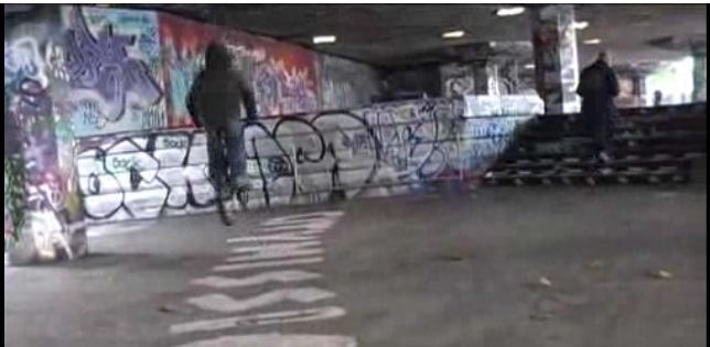
In this screenshot we can see the skate park with the artist doing skills on a bike,this setting creates a good impression of the artist as it helps the audience imagine the life he must have gone through and the hard work he has put in to come to the stage he is now,this gives it a realistic effect.
This is the third screenshot..

The third screenshot is a student reading his worksheets,personally i think that it looks unrealistic and doesnt match the lyrics or the story behind the music video,to improve this i would have created a classroom setting with more students to show that it is a school enviroment,this would have been more realistic and made the video actually look like theres a student.
here is the fourth screenshot..

This is a screenshot showing a student with a watch which is supposed to show that he is looking at the time aswell as showing the audience what the time is,i feel as if this has nothing to do with the video and is pointless therefore it doesnt go well with the rest of the video.
No comments:
Post a Comment